Project context: SAP cooperation project
Duration: 3,5 months
Tools: Figma
Team: Stefanie Lüthen, Alexander Giese
Main Goal: Rethinking software design and the visualization of organizational structures
ERP (Enterprise Resource Planning) software enables companies to plan, control and manage different resources and processes. As ERP systems digitally map a large part of a company's business processes, they tend to be complex and very extensive. SAP is the world's largest provider of ERP software. This course was conducted in close cooperation with the SAP Innovation Center based in Potsdam.
As part of the course, we took a constructive and critical look at the design of ERP systems in general and the current ERP system from SAP in particular. The aim of the course was to find new visual and interactive formats for the presentation of business processes. Data visualization concepts were to be explicitly taken into account.
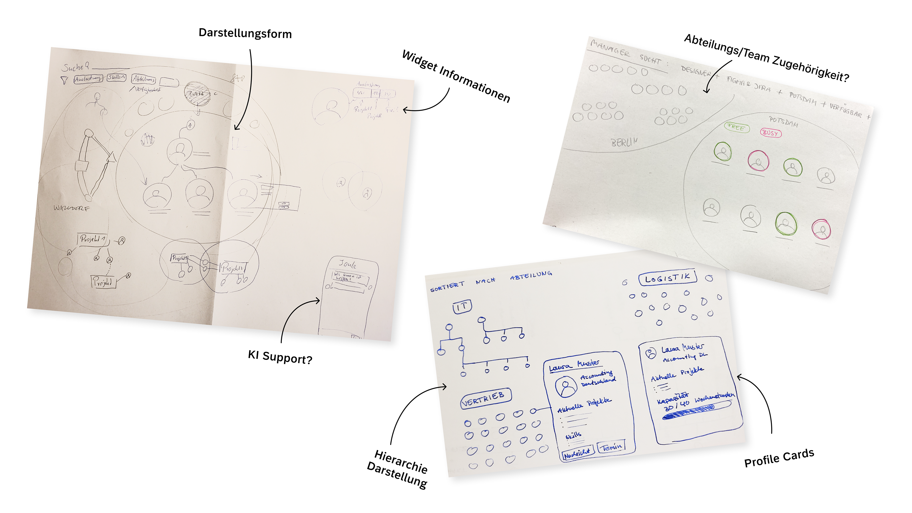
Research
During this research phase, our group came up with the initial idea of taking a closer look at the onboarding process for new employees and redesigning it. Based on personal experience, we were of the opinion that onboarding at a new company is a topic that could be developed further. However, as we quickly realized that the scope for design in onboarding would be rather limited, we finally turned to the so-called org chart, which is part of the onboarding process.
The org chart (organization chart) is a visualization of the company structure, if available. It makes it possible to understand where you yourself, as well as how and where colleagues are deployed in the company. Often only the purely hierarchical structure is shown.
Ideas
Within our group, we had the idea from the outset that our version of the org chart should go beyond the mere representation of hierarchical company structures. If only for the reason that SAP, for example, already uses such an org chart internally. We very quickly saw a lot of untapped potential that could be built into the org chart, such as interactions that are possible depending on the role of the person using it.
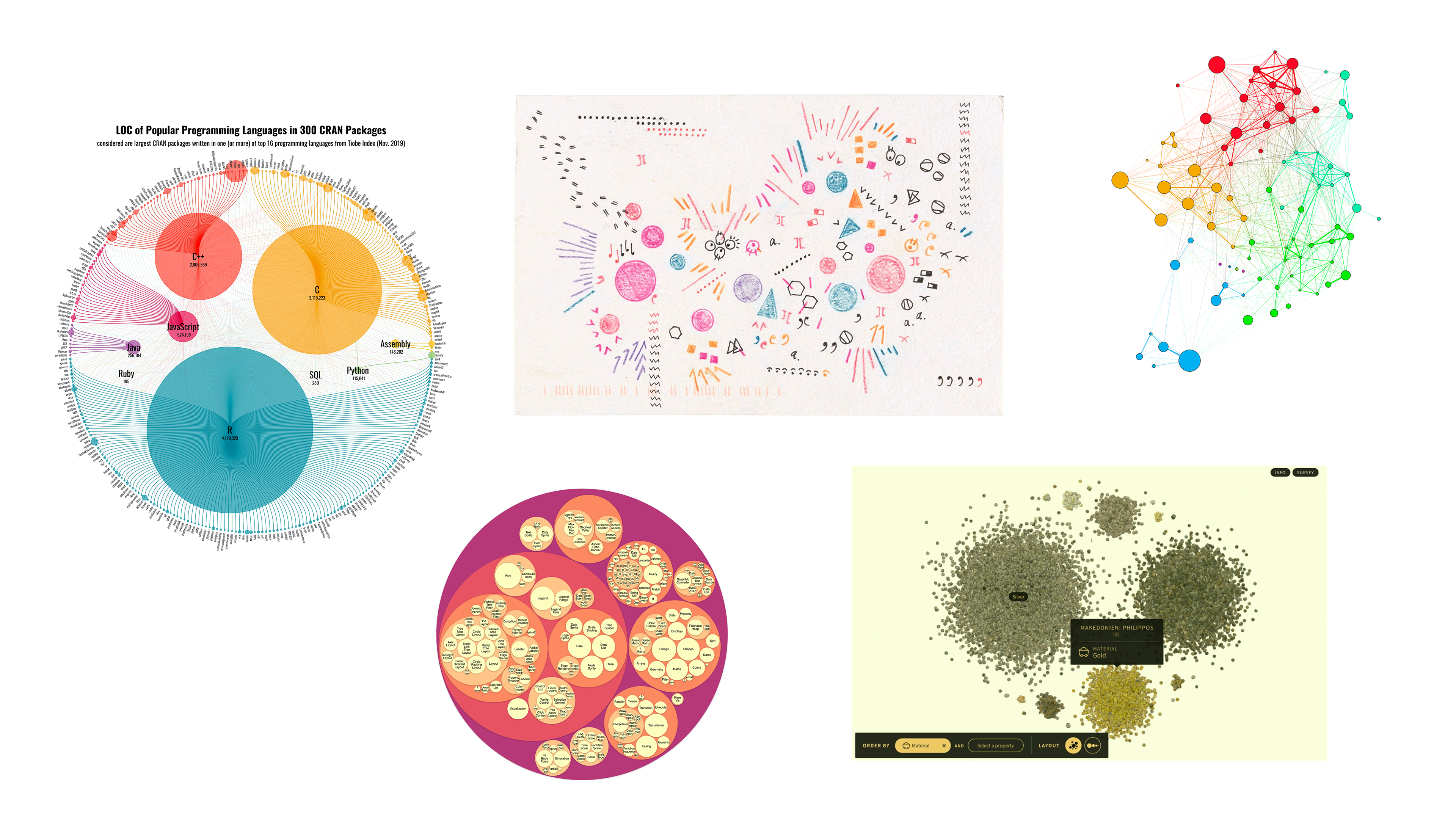
visual inspiration
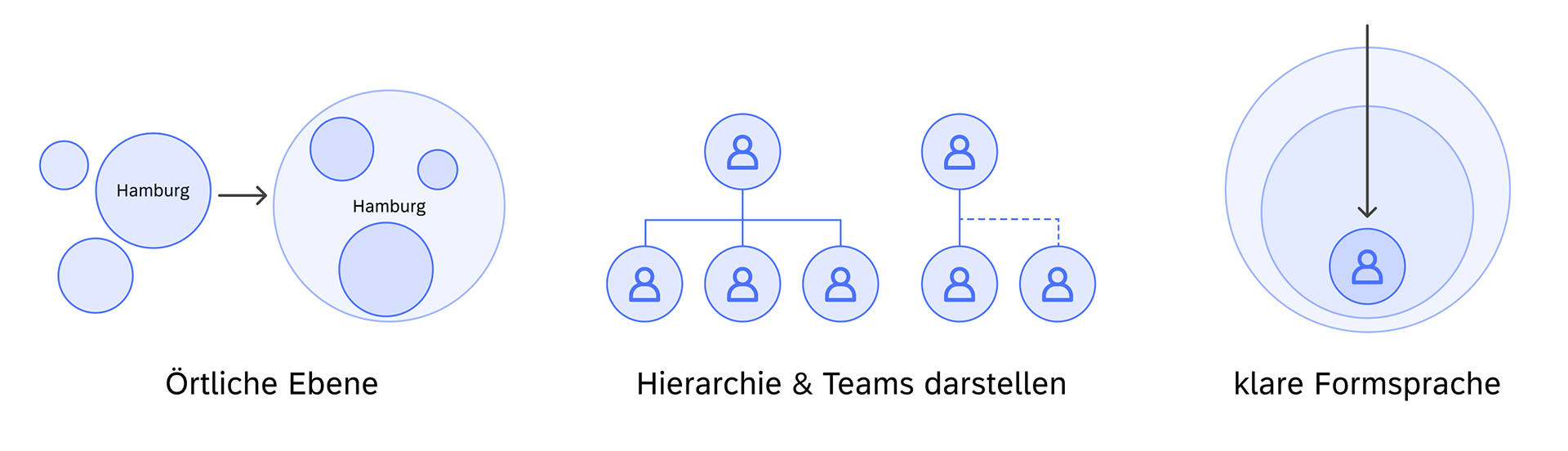
The visual inspiration for our org chart comes primarily from the circular shape itself, cluster representations, circular tree maps and synapse-like connections. This was the best form of representation for us, as relationships between people, projects, departments etc. had to be made clear. From top to bottom, the circle always serves as a kind of container for the level below.
visual language
functional site
Navigation within the chart should be similar to that of a map such as Google Maps or a canvas model. You can move in all directions and zoom in and out. A visually restrained filter bar should enable a precise search using natural language, supported by SAP's own AI model Joule.
Depending on what you are looking for, the results are supplemented with further information or not. Clicking directly on a person opens their profile via a sidebar, where further actions are possible.
Showcase demo of final prototype
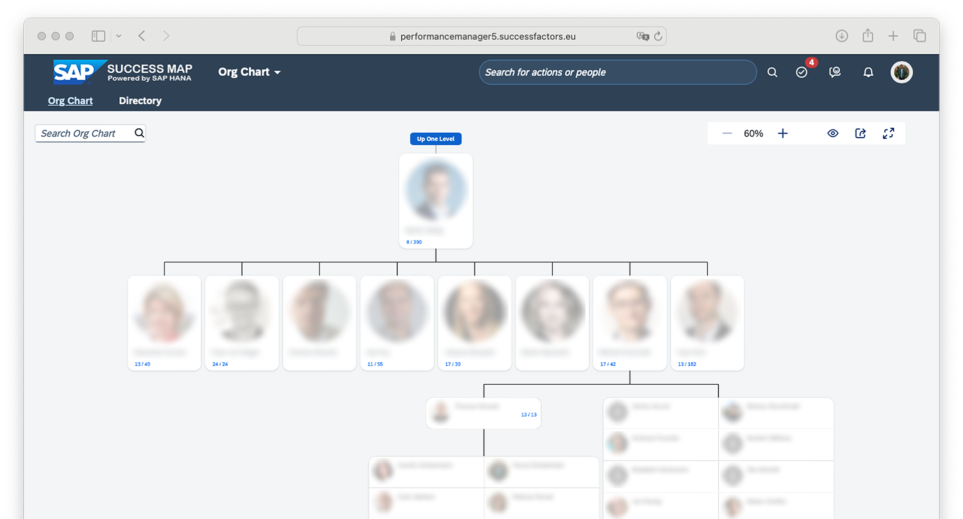
Status quo
• Simple information
• No interactions with individuals or teams
• Orgchart serves more as a link to other tools
• Access via your own profile or search
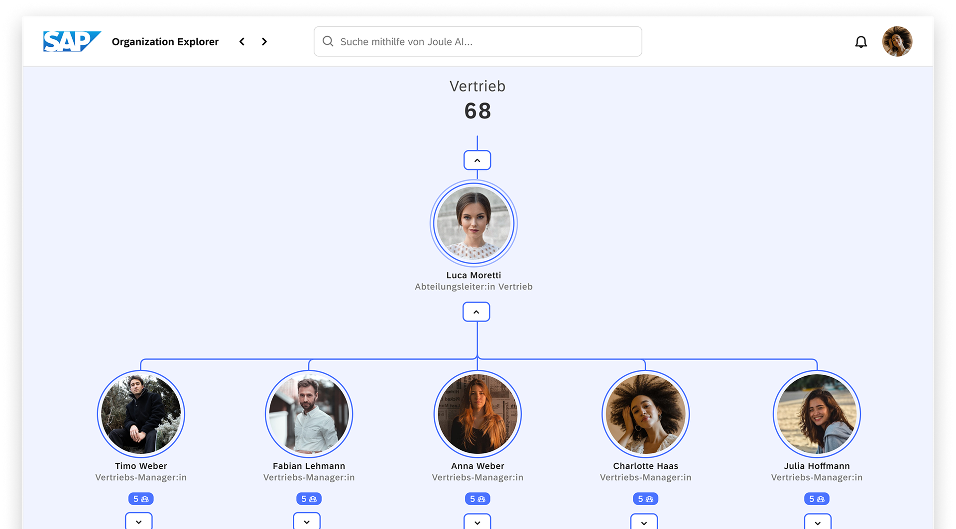
New concept
• Navigation follows clear visual rules
• Interactions with people and teams possible
• Search by natural language
• Informative, interactive profiles
• Hierarchies and teams visible
• Access via own profile, search, location and departments