Project context: University project
Duration: 3 months
Tools: Figma
Main Goal: Redesign of an existing app with iOS components
The redesign of “Too Good To Go” was created during the university course “Apps&Details” by Frank Rausch. The main goal was to understand the iOS guidelines, their importance and how to use them properly.
Task
After short exercises in icon design and app analysis we picked an app we liked and which could benefit from a redesign. The app itself shouldn't be completely poor designed but have some elements and characteristics which could be better and more iOS conform.
Idea
For the task I focussed on three screens from the “Too Good To Go app”: the map, the filter settings and the profile view of food suppliers. Each of these had their own challenge which I will sum up including my improvement ideas.
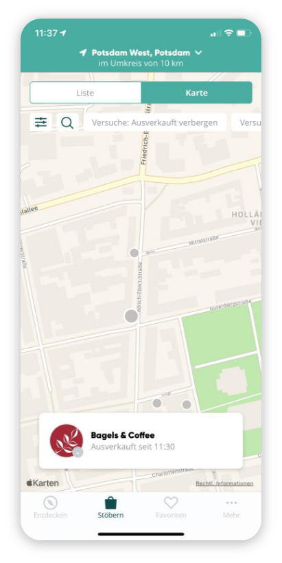
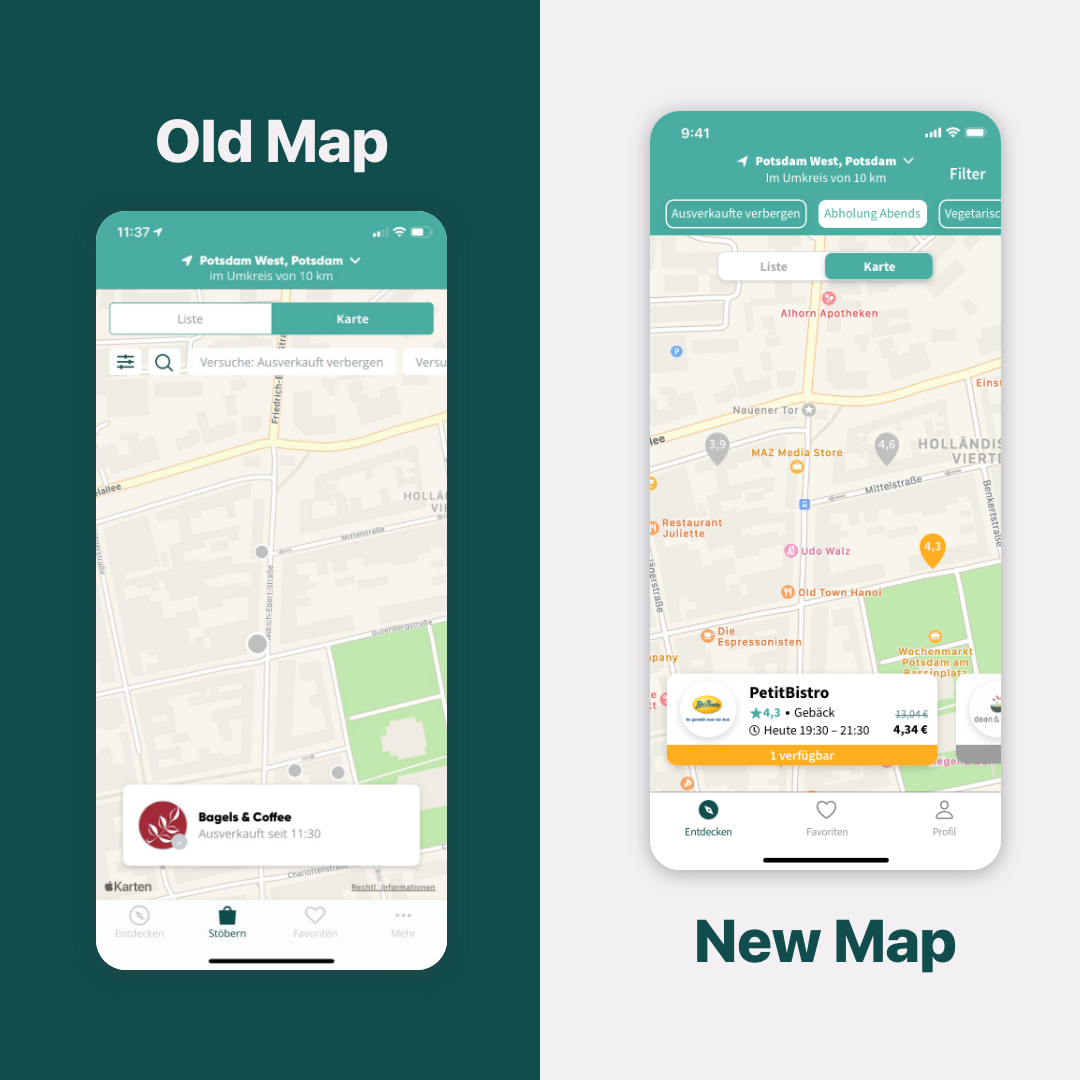
The Map
• the list/map switch is a segmented control but doesn't look like a typical one
• filter suggestions work like the filter button, no change on the map
• the search option is also in the filter settings, no obvious relation between them
• dots on the map are nearly the same color as buildings, too low contrast
• info-box has far too few informations
• the nav bar full loaded with three views and a “more” button
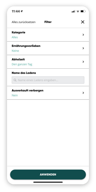
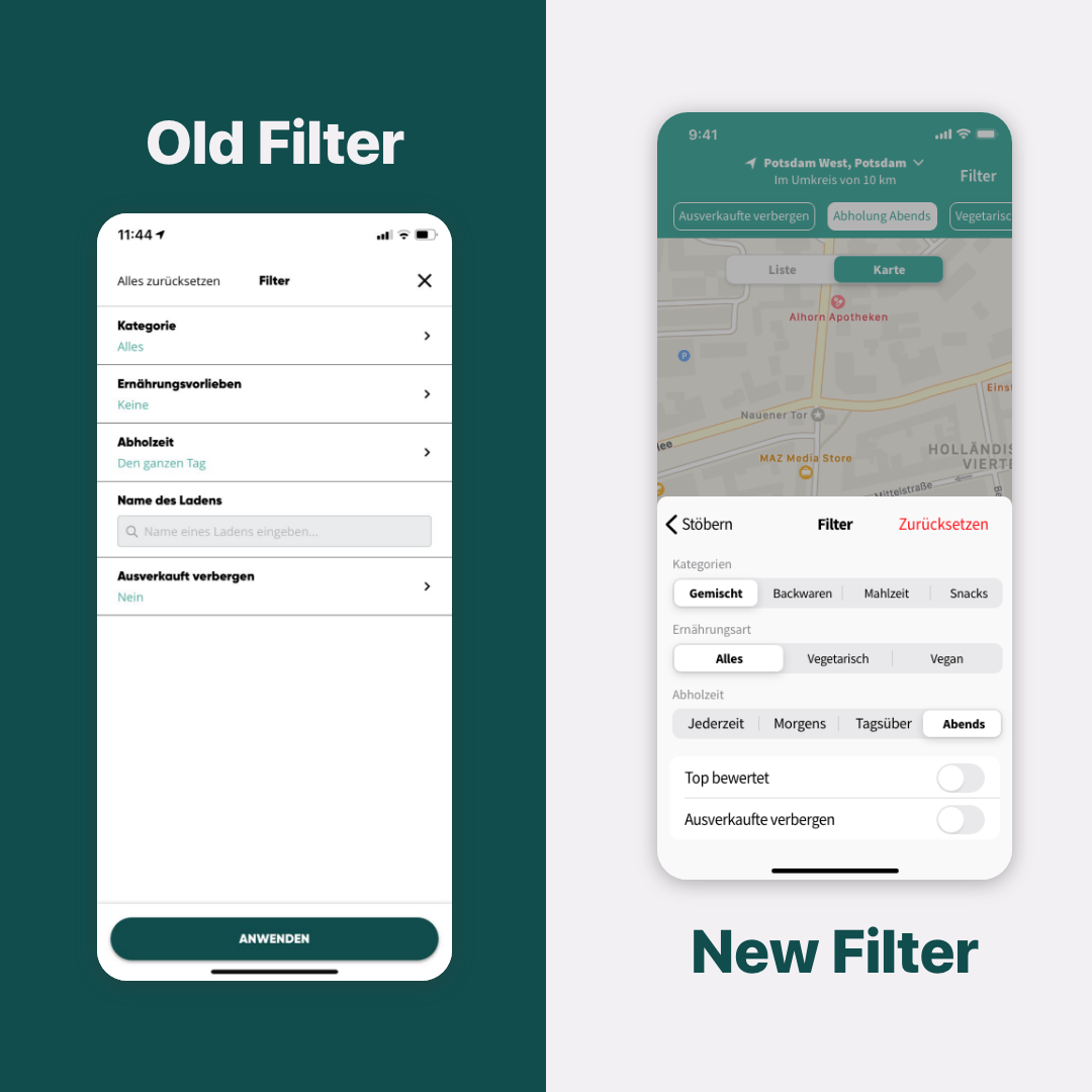
The filter
• works like a modal view, but doesn't look like one according to iOS guidelines
• the search bar placed randomly near the end of options
• overall very boring design without any effort in UX
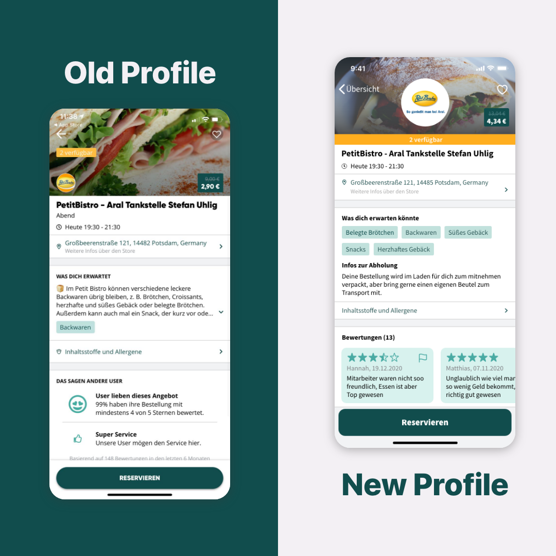
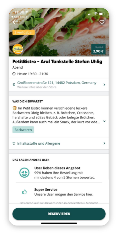
The Profile
• random arrangement of elements in the head part
• profile text has an individual touch but is too long for containing important information
• only one tag which gives a decent clue about what exactly is offered
• last part takes up a lot of space with unclear and unhelpful information about experiences by other users
• in general many elements which are not iOS complaint
Realization and results
The following comparisons show what I changed in the screens and how much few details can improve the usability and look of the app.
The new map offers clear pre settings for the filter, a common segmented control look, new pins for locations, boxes with more useful information and a reduced nav bar.
The new filter got the biggest optical change as it now reduced by some white space. Category, nutrition type and pickup time are now adjustable by segmented controls. This untypical look brings the big advantage to adjust the filter without having to enter each time a new screen everything happens without an interruption. Through reducing the screen height, the user sees all changes directly on the map.
The new profile contains now the most important information for the user. The individual text is replaced by only tags indicating what kind of food is aviable. Comments are a new but more helpful section than former used numeric ratings.